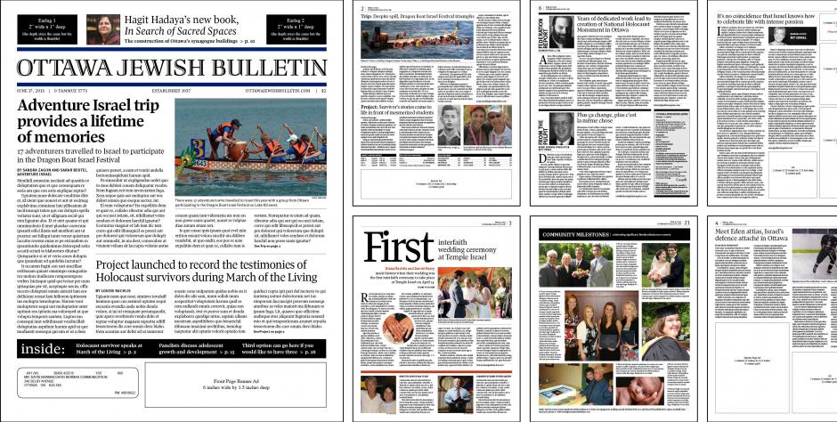
David Berman Communications was hired by the Jewish Federation of Ottawa to help them create a strategy to increase the number of readers of Ottawa Jewish Bulletin. The community newspaper had several updates to its look over its 76 year history and Berman recommended it was time for one more. Along with a new look & feel, the newspaper was going online. Once the strategy was approved, budgets and timelines set, the graphic design could begin. Subscribers ranged from ‘aging existing’ to ‘new young adult’ and included advertising buyers and professional community leaders. We improved the flag design then overhauled the typographic styling and use of images in order to maintain a more dynamic and lively aesthetic presentation. We even went as far as consulting with an Israeli graphic designer to determine what pantone blue was the official blue used to depict the Israeli flag. After considerable research into typefaces, two Canadian typefaces were selected: Richler Pro Highlight was applied to the flag, and Nick Shinn’s Pratt Pro was selected for the main heads, sub-heads, and body text. Templates for typical pages were provided to the in-house graphic designer. To ensure a smooth transition, ad sizes remained the same as the previous layout.