Custom wedding invitations are fun to design but they are intense so I only do them for close friends and family.
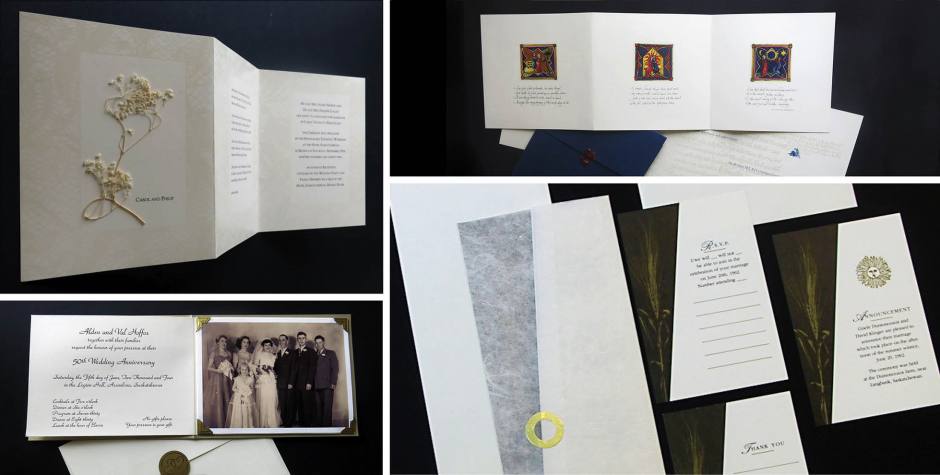
The top left invitation was for my sister’s wedding. It was an intimate and elegant affair held at a Victorian hotel. Her dress was made with beautiful delicate lace and I wanted to incorporate it on the invitation somehow. It was a stressful moment for her when I laid her dress on the photocopier and closed the lid in order to capture it for artwork (this was before digital cameras). The lace texture was printed as a tinted varnish in the borders of the invite. A tiny sprig of dried flowers was hand-glued onto every invitation.
Below my sister’s invitation is my parents invitation to their 50th wedding anniversary. This was a labour of love. Several pieces were hand assembled in this three panel accordion fold invite; the outside cover, the inside flyer, a printout of the wedding party inserted into gold corners, another printout of my parents with their parents in the centre panel, and a gold ribbon tied in a bow to hold the RSVP card and envelope in place. What I loved the most about this invite is the typography, not that I am a big fan of it, but because it was the same typeface my mother had chosen for her original wedding invitation in 1954.
The top right invitation was designed for a very special couple. Heather worked with me at Concepts 3 and her future husband worked at our favourite print shop. They said I could design what ever I wanted but it had to include their two dogs. To accommodate their request, I was inspired by Medieval art because I had this image in my head of these noble dogs lying at their master’s feet by the hearth. On the front, are three hand-painted illustrations based on three verses of a poem called True Love; the first was about love being a humble thing, served in earthen ware, the second is a simple fireside thing, and the third is like a sunset’s golden mystery. The most beautiful element was the typography used for the poem – hand-written script done by a girlfriend of mine. A frequently asked question was what was the name of the typeface? I replied Inderjit (the name of my girlfriend). On the back side was enlarged medieval text screened as a background texture with the details of the wedding overprinted in deep blue. The two dogs are looking in the direction of the text. To finish it off, the invitation was inserted into an elaborate folded piece of cover stock then sealed with the bride’s initial in red wax.
On the bottom right is my first wedding invitation designed for friends who were being married on the summer solstice on the bride’s family farm. In addition to the actual invitation, there are several supporting pieces; the RSVP card and envelope, an announcement card, and a thank you card. The division of white to black symbolized the length of darkness to the length of daylight. A stalk of durum wheat (a popular crop grown on prairie farms) is overprinted onto the black with gold metallic ink. The actual invitation is wrapped in rice paper and sealed with a hand-cut golden ring (I had to wrap and seal 50 of them!).

